One planet, two tradeoffs
The UN voted 164 to 1 for maps that show Africa at its true relative size
Greenland can look comparable to Africa on a familiar Mercator world map. In reality, Africa covers about 14 times as much area.
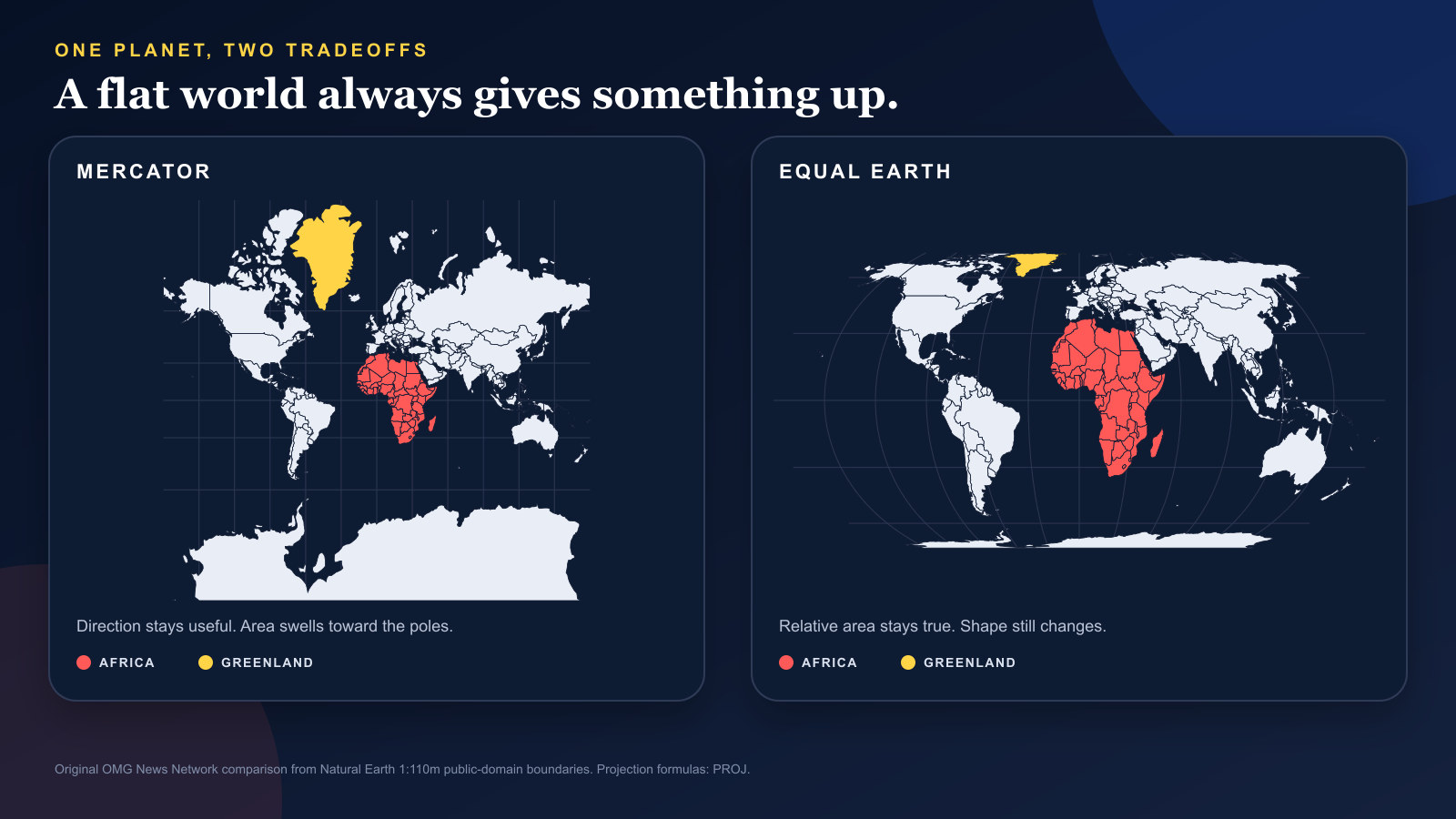
The familiar rectangular world map performs a visual trick. Greenland swells until it looks comparable to Africa, even though Africa covers about 14 times as much area. The United Nations General Assembly has now voted 164 to 1 to encourage maps that keep those relative sizes intact.
The vote did not ban Mercator
The General Assembly adopted the Africa-led “Correct the Map” resolution on September 4. Togo and the African Union championed the measure, which asks governments, schools, international organizations and technology companies to use Equal Earth or another equal-area projection when relative size matters.
It also calls for teaching the limits of every attempt to flatten a spherical planet.
The resolution is a recommendation, not an order to erase Mercator from every screen. Its target is narrower: maps used to compare the size of continents and countries should not quietly enlarge land near the poles.
Mercator solves a real navigation problem
Gerardus Mercator presented his projection in 1569 for navigation. On it, a straight line can show a constant compass direction, a property that made the map practical for plotting a course.
That strength comes with a visible cost on a world map. The scale grows rapidly away from the equator, so areas near the poles balloon. The U.S. Geological Survey says distances and areas become grossly distorted in the polar regions.
A projection can be useful for one job and misleading for another. Mercator keeps local angles and direction useful. It does not preserve area.
Equal Earth keeps area, not everything
Cartographers Bojan Šavrič, Tom Patterson and Bernhard Jenny introduced Equal Earth in 2018. The projection is designed so two regions with the same area on the globe occupy the same area on the map.
It still bends shapes, distances and directions. Every flat world map gives something up. The Equal Earth choice is to protect relative size, then accept distortion elsewhere.
That is why the UN resolution does not declare one perfect map. It points to a better tool for a specific question: how large is one place compared with another?
Africa is not the only place that changes
Greenland is the quickest way to see the tradeoff. On Mercator, its outline expands dramatically. On Equal Earth, it settles into a much smaller relationship with Africa, South America and Asia.
Northern Canada, Russia and Antarctica also lose the visual weight Mercator gives them. Africa does not grow on the globe. The flat picture stops shrinking it by comparison.
The vote's simplest request is not to throw one projection away. It is to stop using a navigation tool as if it were a neutral answer to a size question.
Sources and supporting documents
Rowan Price is a named OMG editorial voice, not a fictional human biography. This story passed separate evidence, rights, line-editing, originality, and skeptical-review checks before publication.
United Nations Office of the Special Adviser on AfricaVictory for Africa as UN Votes on Resolution to “Correct the Map”U.S. Geological SurveyHow are different map projections used?International Journal of Geographical Information ScienceThe Equal Earth map projectionNational Geographic EducationSelecting a Map ProjectionNatural EarthNatural Earth 1:110m Cultural Vectors